Displaying Text
In addition to the guidelines on contrast and color found on the Choosing Color page, the type of font, size of the text, and organization of content are all important aspects of appropriately displaying web text for accessibility.
While the guidelines below mostly cover visual design, it's also important to know and remember that many people, particularly those who are legally blind, may be using screen readers to access, read, and navigate websites. To better accommodate the use of screen readers, it's best to keep navigation links at the top of the page and use appropriate headings and subheadings.
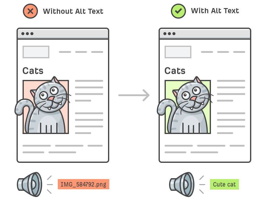
It's also necessary to provide accurate alternative text descriptions for images, snce they can be read with screen readers to allow people with low vision and blindness a better understanding of the website's visuals.
Text Size and Style
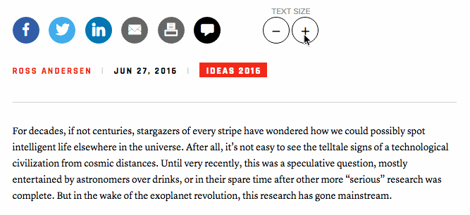
The general consensus for the size of body text is that it should be at least 12 point or 16 pixels to accommodate the majority of people with vision impairments. This can vary widely by preference and the type of impairment, however, so the best way to maximize accessibility is to include an option that allows users to change the size of the text themselves.
While preferences on text style also vary by person, the use of italics on websites is generally discouraged, as it can be difficult for people with low vision to read. Also, italics and bold text are often unreadable for screen readers. It's best to display links as underlined text, and in a different color than the rest of the body text.
Font Type
Serif fonts have long been known to be the ideal choice for readability in printed text, but the opposite is true for web design. Simple sans-serif fonts are the best choice for web accessibility but providing an option for the user to select their own choice of font by using a drop-down menu will allow the reader to pick the one that best meets their needs.
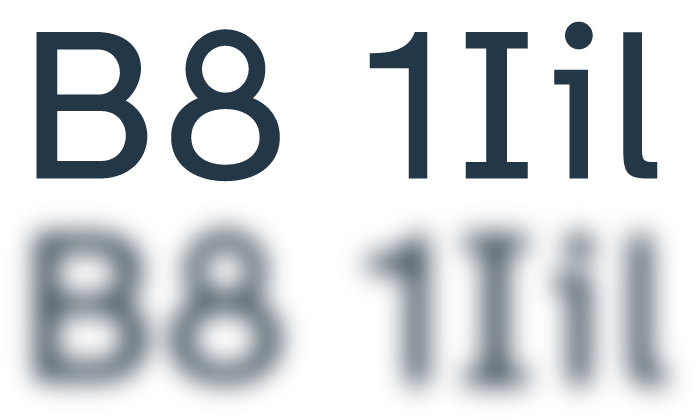
In 2020, the Braille Institute developed and released Atkinson Hyperlegible, a new font that maximized the legibility and readability of text for people with low vision. Atkinson Hyperlegible is a sans-serif font with more distinction between characters that makes it easier to identify letters and numbers.
Atkinson Hyperlegible is the font used throughout this website.
Visit the Braille Institute's website to
download the font.