Choosing Colors
Choosing appropriate colors and patterns when designing a website can greatly improve the readability of a website for people with low vision and color blindness. For the text, backgrounds, images, and any other visual aspects of a website and its content, like charts and graphs, prioritizing the color guidelines will ensure a site is more easily accessible.
Color Palettes
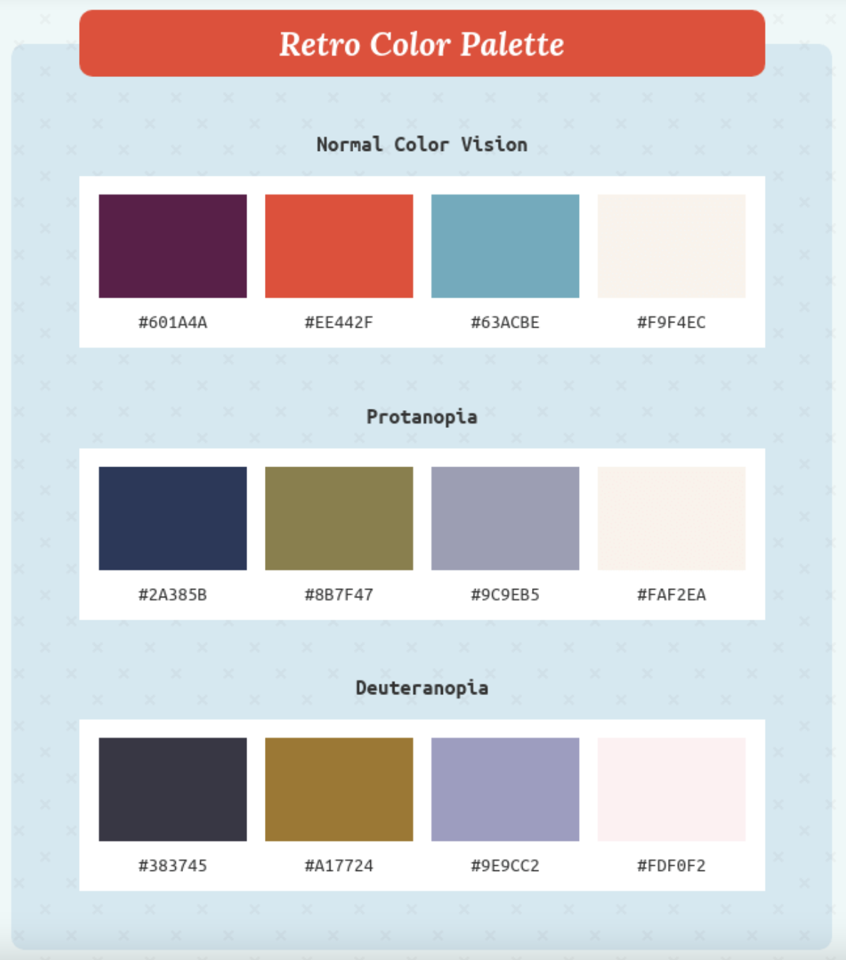
Because people with different types of colorblindness see colors
differently than those with standard color vision, it's best to choose
color palettes for websites that allow each color to be easily differentiated
between the others. As explain in the Contrast page, this often involves
allowing for a wider range of values than prioritizing the hues of colors.
Using colors with limited or no hue is also a good option for
ensuring accessibility for people with all types of colorblindness,
since black text on a white background is the classic combination
for legibility and readability both in print and online.
Many people and organizations have also created various color
palette options appropriate for those who are color blind, so
choosing from the wide range of accessible palettes available is
a simple way to start designing a website's color scheme.
Alternatives to Color
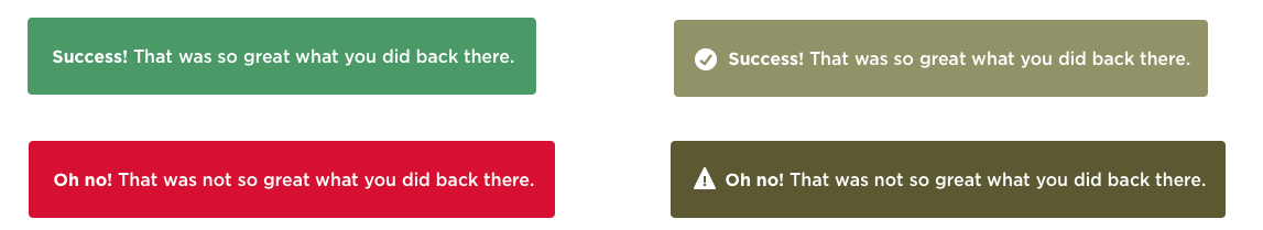
Instead of relying on color alone, you can add symbols and patterns to any part of your website that could use more distinction. Even if there is already text displayed in addition to color, like in a button or chart, using a third identifier can increase the visual distinction for not only people with color blindness, but also those whose primary language is different than the one used throughout the website.
Back to Top