Fonts
Fonts are everything when it comes to readability and the overall look and feel of content within a web page. There are hundreds of fonts, and they are all different from each other in some way. Strokes within a letter can be of different thicknesses and lengths. There can be small flourishes at the corners and edges of a letter, or it can be plain with no embellishments. When a font is poorly chosen, it makes the overall experience worse for the user. Most users have experienced font that was too small or too decorative. It is an irritating experience and can prompt a reader to immediately move on to the next page. Which is just what you don’t want to happen.
Serif vs Sans Serif
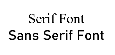
The two most commonly discussed types of font are serif and sans serif. Serif fonts have little extra decorative strokes on each letter, and the
width of each stroke varies. Sans serif fonts don’t have those extra marks. See the example below.
Most sources agree that neither serif nor sans serif can be classified as the best. They fulfill different roles, and different audiences engage differently with them. According to Inkbot Design, serif fonts are considered to convey more tradition, and they work well in print mediums or in formal writing. Sans serif fonts are more modern, and they convey a minimalistic design experience. They work well in digital mediums and in smaller sizes.
Useable Fonts
When fonts are used for content in web typography, they should convey a sense of familiarity and the reader should enjoy a seamless experience. Below are some examples of commonly used fonts:
- Garamond
- Lato
- Times New Roman
- Calibri
- Palatino
- Open Sans
- Baskerville
- Arial
- Helvetica
- Georgia