Aseptico
Website Analysis
Lindsey White
Summary
Aseptico is a company located in Woodinville, Washington that manufactures and distributes dental equipment. I chose to analyze their website after seeing and reading through multiple postings online for their open technical writing position. The position would mostly be responsible for creating and updating product manuals, so I navigated through their website to try to learn more about the company and the technical writer role. Aseptico’s website was designed by a Applied Imagination Media (AIM), a local website development, online marketing, and graphic design company. The website is functional, and the overall design does have some positive aspects, but there is also significant room for improvement.
Audience
Because Aseptico is a manufacture and distribution company, the audience for their website is primarily professionals in the dental industry. This can include representatives, administration, and management responsible for planning and purchase, but because dentists and oral surgeons most often work independently through their own practice or with a small team in a local practice, they’re usually the ones who make the decisions and purchases for dental equipment.
As dental professionals, the audience of Aseptico’s website will be well educated and often experienced in the field. There are also features on the site that may be used by technicians, assistants, and administration staff, such as the pages for receiving support or downloading manuals, but the majority will be used by licensed dental professionals.
Most of the pages are catered well to the audience, with clear headings and subheadings that are easy to navigate. The most important pages, or those that are likely to be the most visited on the site, seem to be the better designed pages, and the writing style is consistent throughout and in the plainest English possible for the content. Professionals often prefer plain Engish to navigate and digest information quickly. As stated by Hoa Loranger in this article on plain language, "highly educated online readers crave succinct information that is easy to scan" which Aseptico uses throughout. Because of the writing and design choices described in the next section, Aseptico could benefit from reexamining their primary audience(s) and designing a professional website specifically for them.
Design
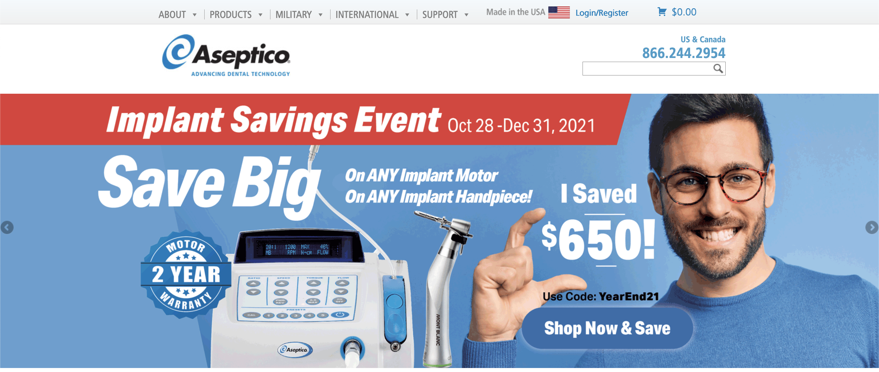
The Home page seems to be the most poorly designed and written page on the site, and appeals to more of a general consumer audience than dental professionals, although many design choices wouldn’t work well for either. The navigation menu is at the top of the page and easy to distinguish from the rest of the content, although the contract between the text and background may be low, but this clear navigation menu is likely to be the most important to professionals who may even avoid the messy Home page entirely. The first image currently shown on the Home page is a large banner marketing their savings event, and a quote shown directly after is too large and appears as a heading.
The real headings of the page are blue banners with white backgrounds, which are also the same design used for their button links, which can cause a lot of confusion. The inability to distinguish between headings and button links would make any user feel ignorant, and dental professionals spending a lot of money on expensive equipment could potentially be frustrated enough by a confusing website to want to take their business elsewhere.
The font and color choices are good for this site and a tech-forward company in healthcare. Aseptico uses simple san-serif fonts, and sticks to a color scheme of blues and greys on a clean white background. Blues are most often used for health and medical websites, and sans-serif fonts present a more modern and technical look, as opposed to serf fonts that can appear traditional and artistic. Aseptico would also benefit from using higher resolution images for their logo and the icon links used in the footer, since they appear blurry and can be difficult to read, especially since the text is in all-caps.
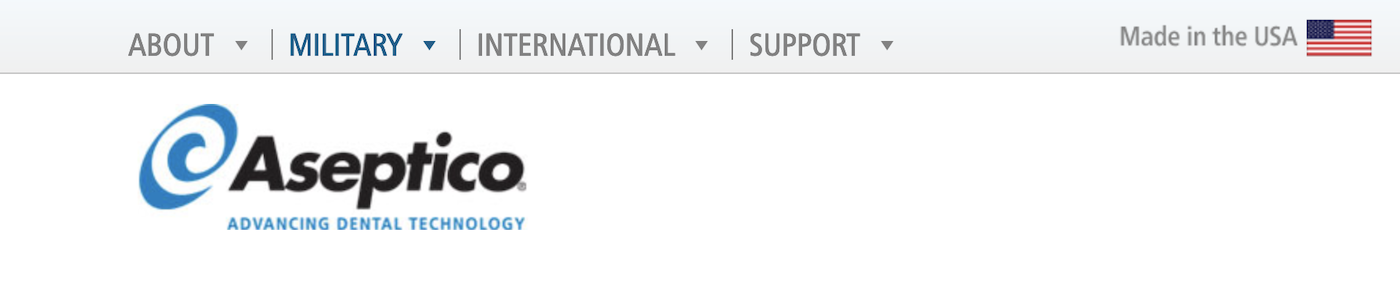
In addition to the design choices, there are a few areas where there are some clear errors in the HTML/CSS used. The Home page should only scroll up and down, but there’s a full section of white space to the right of the page that causes the page to scroll let and right as well. The Military page also includes some overlapping images and text. There’s also a section towards the bottom that is far too narrow for including text, which seems as though it should be displayed on the right side of the page, which presently displays only white space. While navigating through the Military page, I also noticed the navigation menu loses its Products link, which is noticeable when navigating through pages since the menu’s length is drastically shortened on this page.
Content
The nonlinear organization of content on the Aseptico website is done well in some areas but could also use improvements in many. This article on Evolution Digital's website tells us "how you make your audience get to the content, view it or scroll it, will help them to shape their interpretation of what you are telling them" and in a few ways, Aseptico makes it difficult for users of their website to naturally navigate their content without the use of the navigaiton bar.
Although most users are more likely to use the navigation menu to navigate this site since they’ll likely already knowing what they’re looking for, it's best to include sections, blocks, and links to navigate new users through the website. The first thing a new visitor may notice on the website is they were browsing the content in order, is that the navigation is flawed for the first marketing banner shown on the Home page. The “Shop Now & Save” button links to the appropriate page listing the current discount and offers, but then they’re led to the “Shop Online Now” link, which only redirects them back to the Home page. If this link were to lead them to the “Products” page, the viewer would be taken to see the array of equipment Aseptico offers.
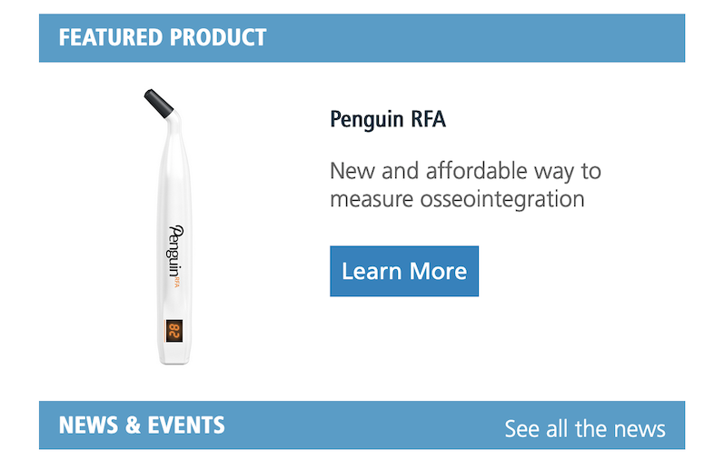
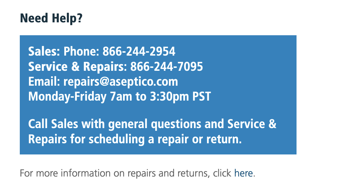
The rest of the Home page is organized well for nonlinear browsing with its current content, from their Featured Product section leading to the product page, to the links list under News and Events. Some links could be emphasized more for better nonlinear navigation, such as the link to click for more information on repairs. Although the rest of the Home page navigates well, Aseptico should include more information and links on their Home page that will lead the viewer to their Products page and Support page without the need to scroll back up to the navigation bar.
Most pages offer better non-linear organization and navigation than the Home page, although another suggestion I would offer is to include the PDF link for the product manuals on product’s page in the Shop Online section. This would allow viewers to find their product by image and cost if they were unsure of its name or product number and wanted to download the manual. Aseptico does organize their Products page well overall, especially since clicking each product leads to a page of parts and other products related to it, so a viewer can easily navigate through the section to find the parts they may be looking for.
Back to Top